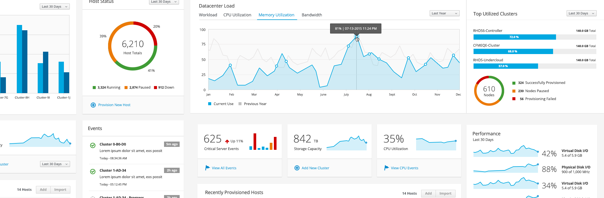
PatternFly Charts
Andres Galante
wrote this on
June 04, 2015
under patternfly category.
Data visualizations are fascinating. When well executed, they are an amazing medium to visually represent massive volumes of dynamic information.
But of course that’s not easy. From a simple pie chart to a complex infographic, they each offer complicated design challenges.
As part of the effort to promote common dashboards, the PatternFly team will cut a release this week that includes PatternFly styles for C3js charts, and Aerogear Unified Push Server UI will probably be the first to implement them.
If a picture’s worth a thousand words, what’s the value of an image representing a terabyte of data?
Hunter Whitney asked in this excellent article.
##PatternFly charts
For this first release, patternfly charts will include:
- Line Chart
- Sparkline
- Spline Chart
- Area Chart
- Stacked Area Chart
- Bar Chart
- Stacked Bar Chart
- Donut Chart
But there are plans to expand this list with heat maps and other charts soon.
C3js + PatternFly styles
They are based on the robust and tested C3.js, which is a D3-based reusable chart library.
Patternfly charts are superbly designed to keep consistency with the rest of the library styles. They are optimised for good readability, their colors are color-blind tested and they show animations which supports the interactions and hierarchies.
##PatternFly at DevNation
As I mention before, I’ll be at the PatternFly booth at DevNation. If you happen to be around, let’s geek out about charts!