CSS rounded corner hexagon
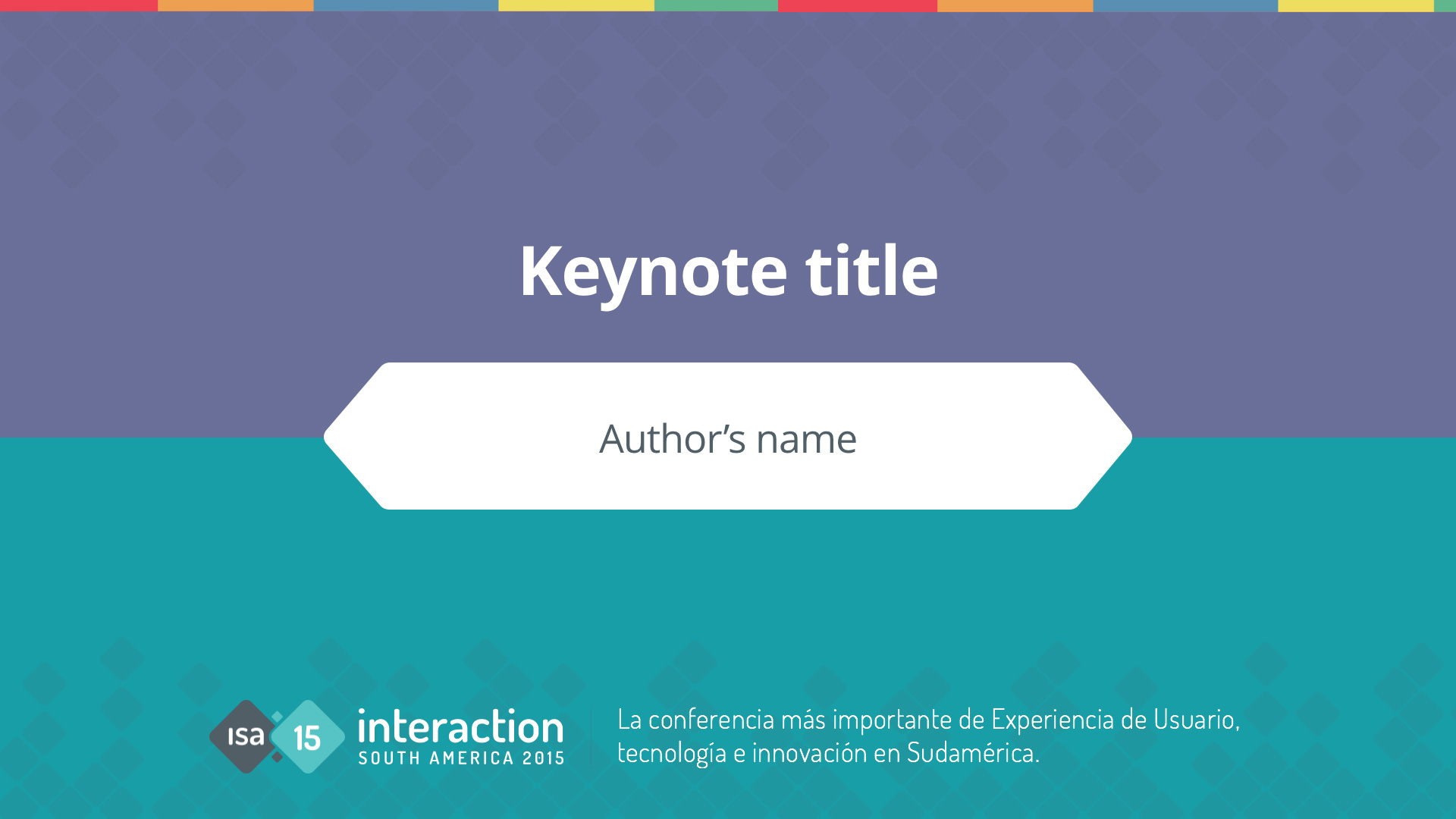
On Friday I received the opening and closing slides to include on my presentation for the upcoming talk at Interaction South America 2015 in Cordoba, Argentina.
The opening slide has the title of the talk, the author’s name inside an hexagonal shape with rounded corners in the middle of the screen and some information at the footer.
Everything is laid over a two color background spilt horizontally in the middle. There is also a transparent pattern and a stripe at the top.
They sent the slide in Keynote and Powerpoint flavours, and I though: “what if anyone want to use reveal, there should be an HTML version of this… How hard can it be to build it?”
There was only one way to answer that question, by doing it.
The HTML
The HTML is simple, with a title on an h1 tag, the name of the author on a p tag and a footer, but framing the authors name on a rounded corner hexagonal box that is horizontally and vertically centred end up been a mathematical challenge.
<body>
  <h1>Keynote title</h1>
  <p>Authors Name</p>
  <footer>This is an HTML version of the opening slide for ISA 2015 presentations.</footer>
</body>
The SCSS
There are two challenges overcome. The background and the rounded corner hexagonal box.
Background
For the background I am applying CSS multiple background on the body:
- I start with a linear gradient to generate the stripes at the top;
- Then there are 2 svgs to generate the pattern. It has a blend more of multiply;
- I also am adding a little shadow at the top;
- and finally I paint half of the screen with a gradient stripe.
  background-color: $color-background-bottom;
  background-image:
    linear-gradient(to left,
                    $color-background-stripe-01, $color-background-stripe-01 200px,
                    $color-background-stripe-02 200px, $color-background-stripe-02 360px,
                    $color-background-stripe-03 360px, $color-background-stripe-03 600px,
                    $color-background-stripe-04 600px, $color-background-stripe-04 800px,
                    $color-background-stripe-05 800px, $color-background-stripe-05 960px
                    ),
    url(../img/pattern.svg),
    url(../img/pattern-bottom.svg),
    linear-gradient(to bottom, rgba(0,0,0,.1), transparent 100%),
    linear-gradient(to bottom, $color-background-top, $color-background-top 50%, transparent, transparent 50%);
    background-size: 960px 10px, 700px,700px, 100% 20px,  100%;
    background-repeat: repeat-x, repeat-x, repeat-x, repeat-x, repeat;
    background-blend-mode: normal, multiply, multiply, normal, normal;
    background-position: 0 0, 0 0, -330px bottom , 0 0, 0 0, 0 0;
The hard part: a rounded corner hexagon
To explain how I created this hexagon I have to take you back to school.
The hexagon is a rectangle with two 45º rotated squares on each side. This means that if the height of the squares is x, the rectangle should be x times the square root of 2.
But it’s not that easy, I also need to consider the rounded corner of the squares. Trigonometry to the rescue, again. First I discover the size of the hypotenuse and I subtract the diference of the border radius.
I did all this math, so you don’t have to.
This sass mixing will generate a rounded corner hexagon and absolute position it at the center of the screen. You are welcome.
@mixin rounded-hexagon($hexagon-height: 5rem, $hexagon-radius: .5rem, $hexagon-bg-color: white, $hexagon-font-size: 1.6em, $hexagon-color:#515F67 ) {
  margin: 0;
  color: $hexagon-color;
  background: $hexagon-bg-color;
  height: calc((#{$hexagon-height}  * 1.414213562373095) - (((#{$hexagon-radius} * 2) * 1.414213562373095) - (#{$hexagon-radius} * 2)));
  line-height: calc((#{$hexagon-height}  * 1.414213562373095) - (((#{$hexagon-radius} * 2) * 1.414213562373095) - (#{$hexagon-radius} * 2)));
  position: absolute;
  top: calc( 50% - (((#{$hexagon-height}  * 1.414213562373095) - (((#{$hexagon-radius} * 2) * 1.414213562373095) - (#{$hexagon-radius} * 2))) / 2));
  left: 50%;
  margin-left: -9em;
  min-width: 18em;
  text-align: center;
  font-size: $hexagon-font-size;
  &:after, &:before{
    content: " ";
    transform: rotate(45deg);
    transform-origin: 0px 0px;
    background-color:$hexagon-bg-color;
    width: $hexagon-height;
    height:$hexagon-height;
    top: calc(((#{$hexagon-radius} * 1.414213562373095) - #{$hexagon-radius}) * -1);
    left: 0px;
    position:absolute;
    border-radius: #{$hexagon-radius};
    z-index: -1;
  }
  &:before{
    left: 100%;
  }
}And here is the code altogether:
<h1>Keynote title</h1>
<p>Author's Name</p>
<footer>This is an HTML version of the opening slide for ISA 2015 presentations.</footer>
See the Pen CSS Hexagon Rounded Corner by Andres Galante (@andresgalante) on CodePen.
Will I use it?
Of corse not. Keynote is awesome to build presentations, plus it has the way underused flame effect that I alway try to sneak in all my talks.
I am sure there are way better ways to do hexagonal rounded corner shapes, this one doesn’t feel elegant enough. But it was good fun to build it.