Font pairing is a bitch
Andres Galante
wrote this on
September 17, 2015
under howto category.
Today Bruno asked me about font pairing. He wanted to change his blog styles and have a different typefaces for the titles and the body text.
Here is what I have to say about font pairing: Don’t do it unless you really know what you are doing.
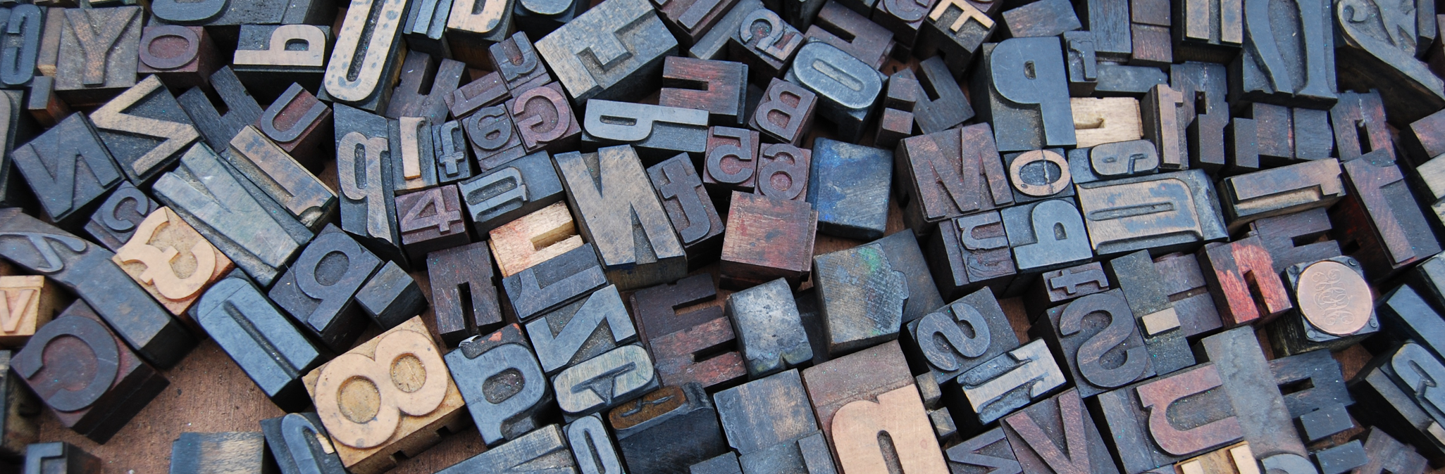
Typography is really hard. Choose just one font family and you can’t go wrong, even if that typeface is comic sans.
Remember to pick one that has several styles. Then create contrast by changing the weight.
For example this blog uses Titillium Web from Google fonts. Titles are semi-bold and the body text is light.
What if I want to it anyway?
Bruno asked.
So, if you really want to get into font paring and you don’t wan’t study typography for years: copy from someone else.
Typekit has an excellent gallery to get “inspired”.
If you want to go Google fonts way (and you should) check Google type project.
Beautiful web type has some very nice examples on how to use font on the web.
For print samples check Font you and Fonts in use.
And always remember Picassos words:
Good artist copy great artist steal
There you go Bruno, I’ve already told you all this a few minutes ago, now it’s written.